Let’s see how to bring the browser menu bar into the bottom of the screen by enabling the Google Chrome Duet Flag. Editor’s Note: Chrome flags are hidden features and enabling them might result in crashes or performance and other issues. We have tested and got all the screenshots from Google Chrome 75.0.3 version. The Home flag has since been deprecated in favor of Chrome Duet which brings a split toolbar interface. The Chrome Home flag still work for Google Chrome Stable 65 or older version.
How to Bring Chrome Toorbar to the Bottom of Android.
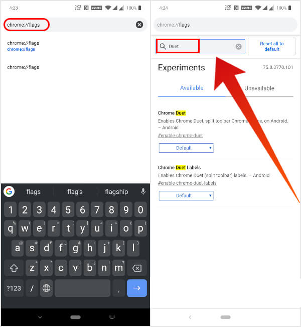
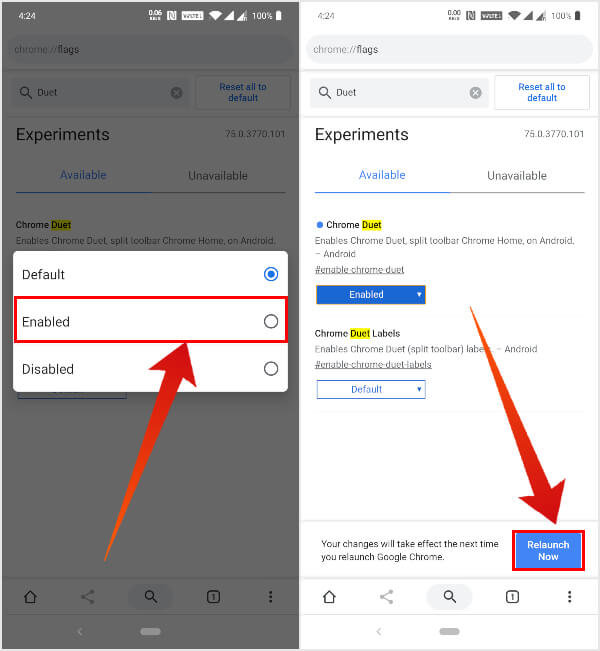
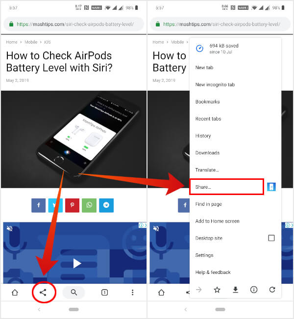
To bring the Chrome toolbar bottom of the browser, you have to enable the Chrome Duet flag first. Let’s see the stps here to enabel the Chrome Duet flag. When Chrome restarts, you should see the new split toolbar UI in the bottom of the browser. In case you don’t, restart Chrome again and that would do the trick. As you can see in the screenshots above, without Duet ON, there is no menu bar in the bottom. When you enable the “Duet Flag,” the Chrome Browser brings a menu bar in the bottom. There is a three-dot overflow menu button also coming with additional menu options. The home button is also added, along with share and search buttons. None of these icons are too complicated to comprehend. However, if you still find it difficult to understand, or you simply want to have labels on each button for aesthetic reasons, you can do so as well. Just go back to the flags page and enable the Chrome Duet Labels flag similarly.
Why do you Need Split Toolbar in Chrome
As mentioned earlier, I’ve been using this feature for over a year and have yet to run into any issues. It’s stable enough for daily use, but Google is probably not sure whether it’s something they want to implement just yet into Chrome. Until they do, the feature might disappear or get modified into something else in later updates. As it stands now though, the split toolbar UI is helpful. With phone screens getting bigger and bigger each year, one-hand use is simply a thing of the past.
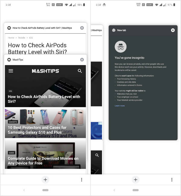
Someone with smaller hands and a phone with a 6.67-inch display can appreciate the new bottom toolbar. The bottom controls are also available on the tabs page, which makes tab management and switching a lot easier as well.
A few things do still need ironing out such as the presence of the Share button on the toolbar as well as the same option being available in the overflow menu. It could perhaps be replaced by the reload button instead which is more often used.
Chrome Duet Split Toolbar UI
Google maintains four different update channels for Chrome to test new features and changes. Once an update has passed throw the Canary, Dev, and Beta channels, it finally gets to the Stable builds. Even then, every user might not receive the said feature. The Chrome Duet split toolbar on Android is one such example, not yet a built-in feature yet. Chrome Duet is a chrome flag which enables a new split toolbar UI that is still under testing. The feature has made it to the stable builds though, so it’s not quite a beta feature. I’ve been using it for over a year without any issues. Once enabled, the menu and tabs buttons next to the address bar are moved to a toolbar on the bottom along with some other controls. The address bar still remains at the top. While it’s not quite the same, it does help by placing a search button on the bottom toolbar. Tapping this button has the same effect as tapping the address bar and lets you type a web address or query.
Δ


